What Instagram Highlights Actually Do
Highlights are free, permanent, top-of-profile real estate.

INSIGHTS
What Instagram Highlights Actually Do
Time to read
3 min
Published on
Share
Think of your Instagram profile as a shop window. Someone's walked past, glanced in, and is deciding whether to come in. Your bio is the sign above the door. Your grid is what's in the window. Your highlights? Those are the little signs pointing to "Sale," "New In," "Opening Hours," "About Us." They're navigation, not memories. That's the mindset shift.
A new visitor isn't going to scroll through 200 grid posts to work out what you do, who you are, or whether you're legit. They'll glance at your highlights for about three seconds. That's your window.
What They Should Actually Communicate
Not every highlight needs to exist forever, but a strong set usually covers:
1. Who You Are / What You Do A quick "about" - your story, your team, what makes you different. This is where personality lives. For a service business, this might be "Meet the Team." For a product, "Our Story."
2. What You Offer Services, products, packages - whatever the "menu" is. This is the bit that turns "looks nice" into "oh, they actually do the thing I need."
3. Proof Reviews, testimonials, results, before/afters, client work. People trust other people more than they trust your own marketing - this is social proof doing the heavy lifting.
4. How to Work With You / Buy The practical bit. How do people enquire, book, order? Don't assume they'll find the link in bio - show them what happens when they click it.
5. Behind the Scenes / Personality This is where the personality of your brand lives. Process, team moments, day-to-day - the stuff that makes a business feel like people, not a logo.
The Visual Bit (Don't Skip This)
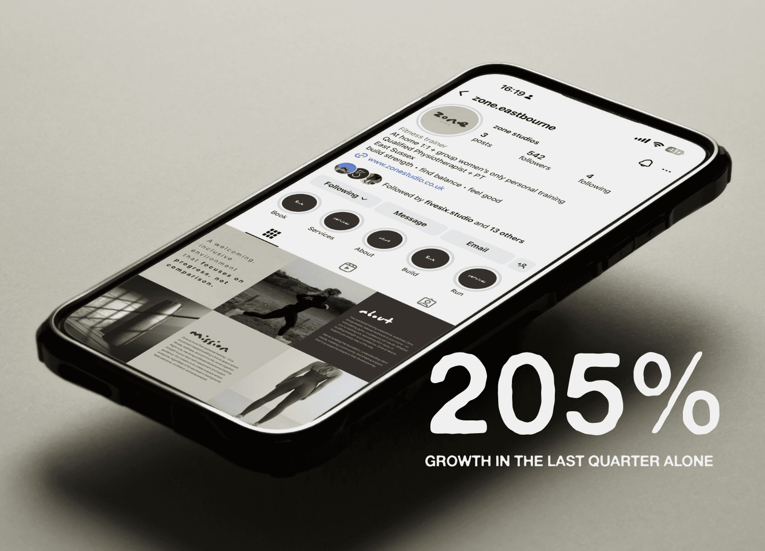
A row of mismatched, random-coloured highlight covers screams "we set this up once in 2019 and never touched it again." A consistent set of covers - using your brand colours, a simple icon style, or even just a consistent filter - instantly makes a profile look more considered, even if the content behind them is simple.
This doesn't need to be complicated. A clean icon + your accent colour, repeated across each cover, does more for perceived professionalism than people realise.
What to Avoid
Too many highlights. If there are 15 circles, nobody's tapping through all of them. Pick your priorities - 4 to 6 is usually the sweet spot.
Outdated info. A highlight showing an old price, an old address, or a promotion that ended eight months ago is actively working against you.
No highlights at all. Especially for service businesses - this is one of the easiest, cheapest ways to build trust before someone DMs you, and it's sat there empty.
The Real Point
Highlights are free, permanent, top-of-profile real estate. Most businesses either ignore them completely or fill them with whatever's left over after stories disappear. Treat them instead as a tiny, curated version of your website - the four or five things you'd want a brand-new visitor to know, always visible, always on-brand.
It's a small thing. But small things, done properly, add up to a profile that feels like it knows what it's doing.
If your highlights (and the rest of your socials) could do with a proper once-over, that's exactly the kind of thing we get stuck into.